


The Brief: Create the brand language for Peppertap.com, a hyperlocal grocery delivery startup with a view to revolutionise grocery shopping in India. It was the quick and easy way to buy your everyday needs online, with guaranteed quick delivery and fresh products.
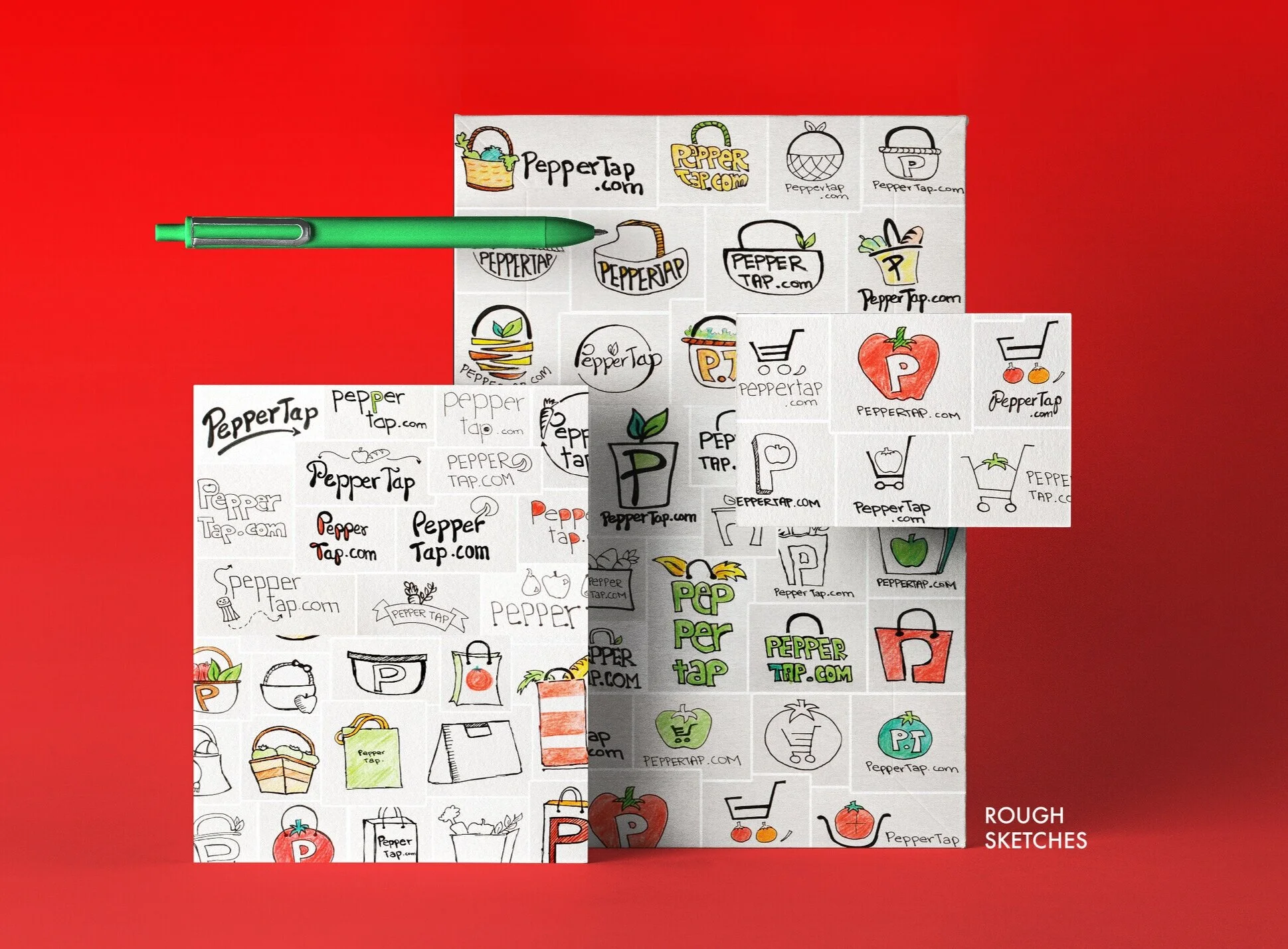
Design Challenge: Create a smart, young identity to be used across all digital and print platforms with a budget constraint. So the brand language needed to be designed in such a way that I could create all the collaterals from scratch without using external vendors.
The Outcome: An identity using minimalism, bright colours, iconography, bold type and smart language was created. The colours red and green were used across collaterals as they represent freshness, which was what Peppertap.com prided itself on. The clean, icon based visual language was an efficient way to communicate what the brand stands for.
Copywriter: Vishal Sudhir